( Strategy, Identity, Motion, Web, Direction )
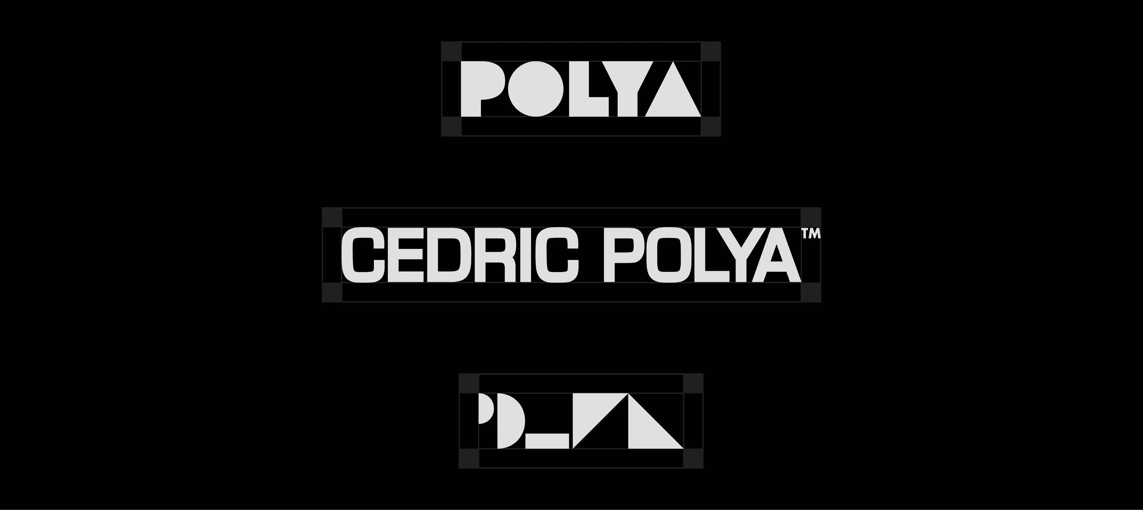
Logo System
Beyond a Single Mark
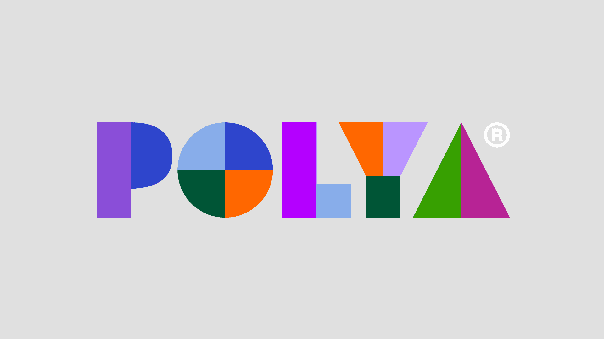
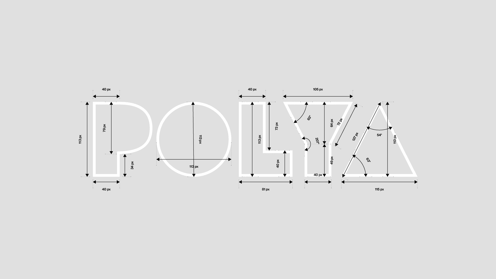
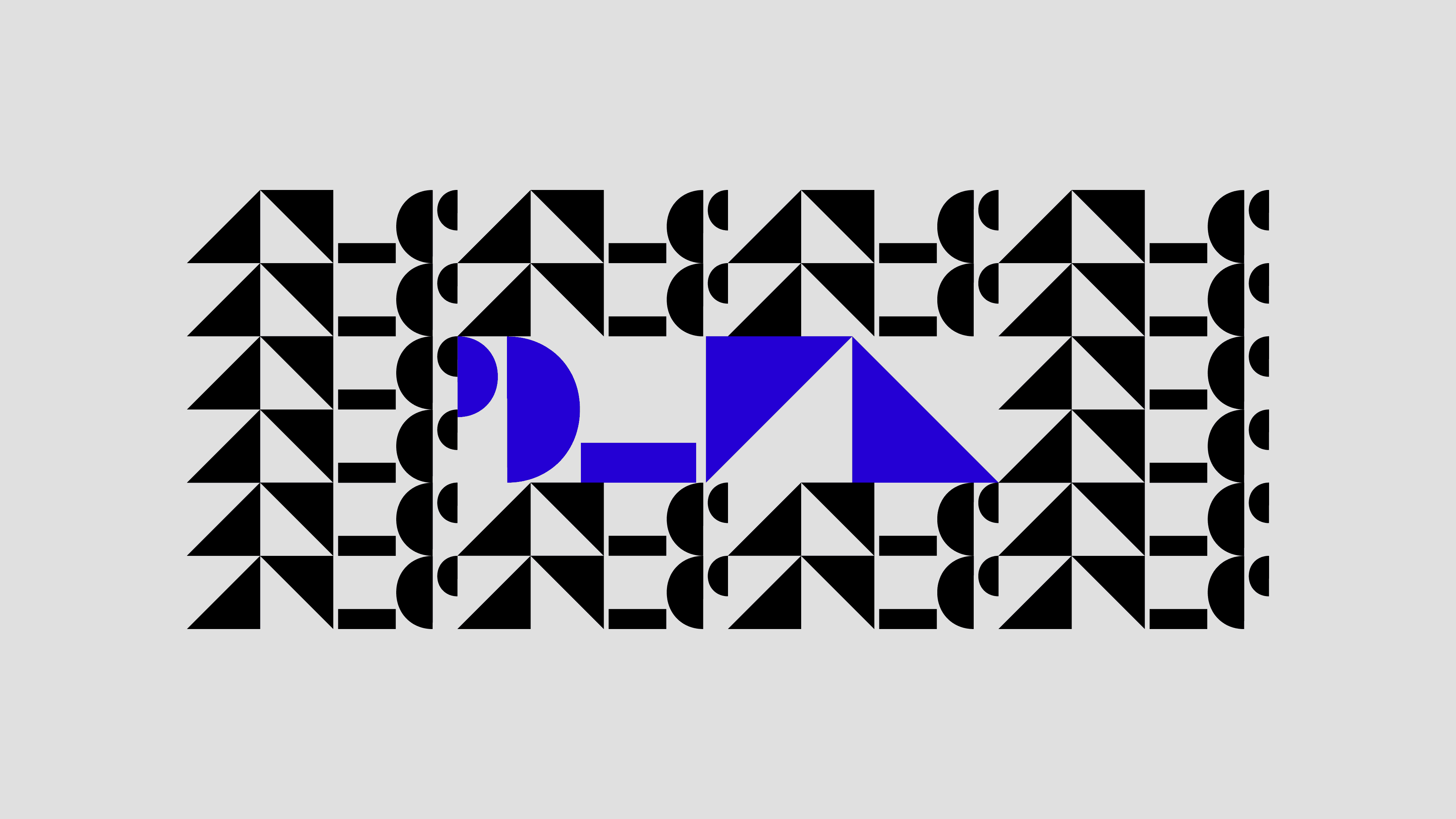
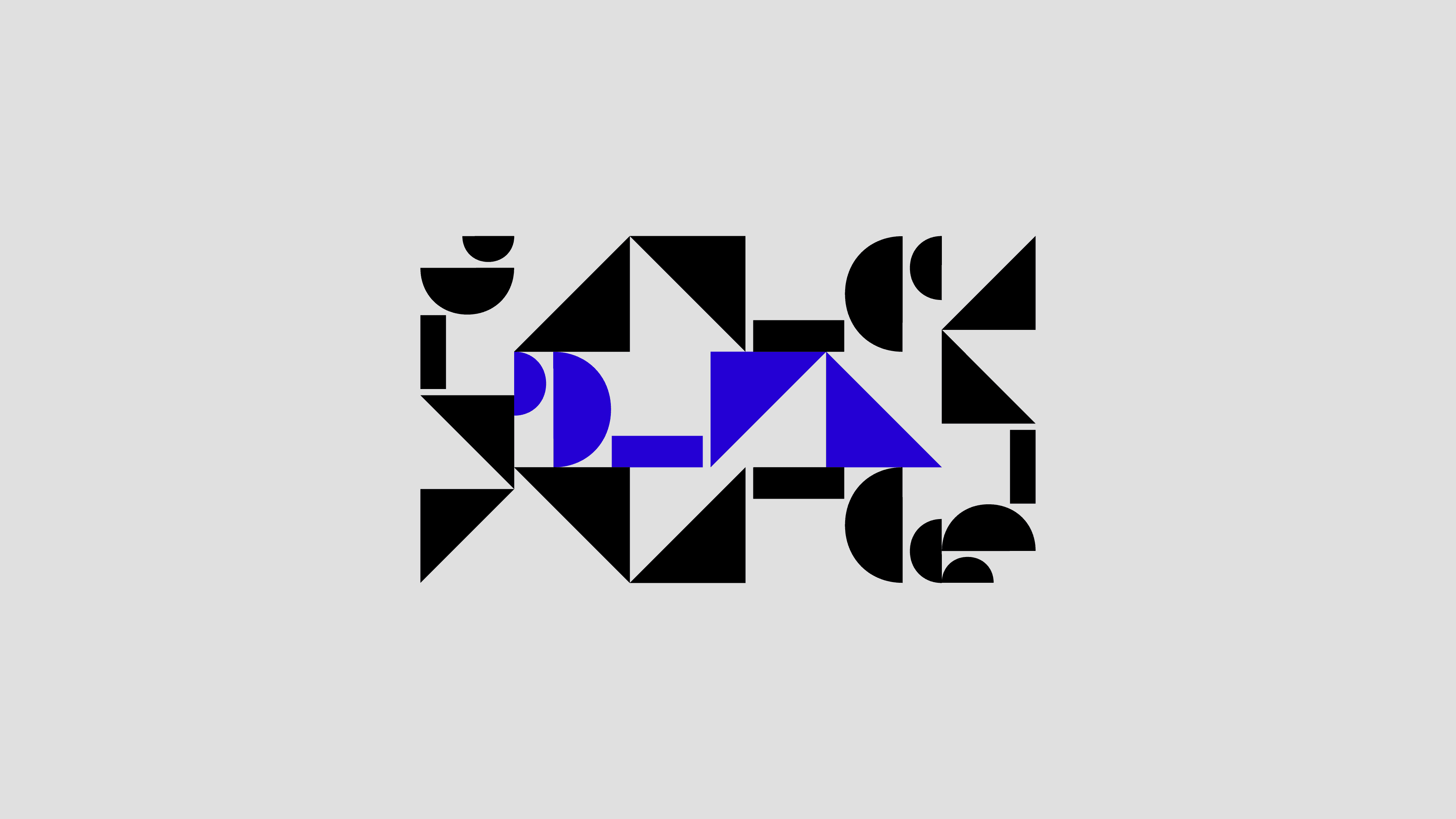
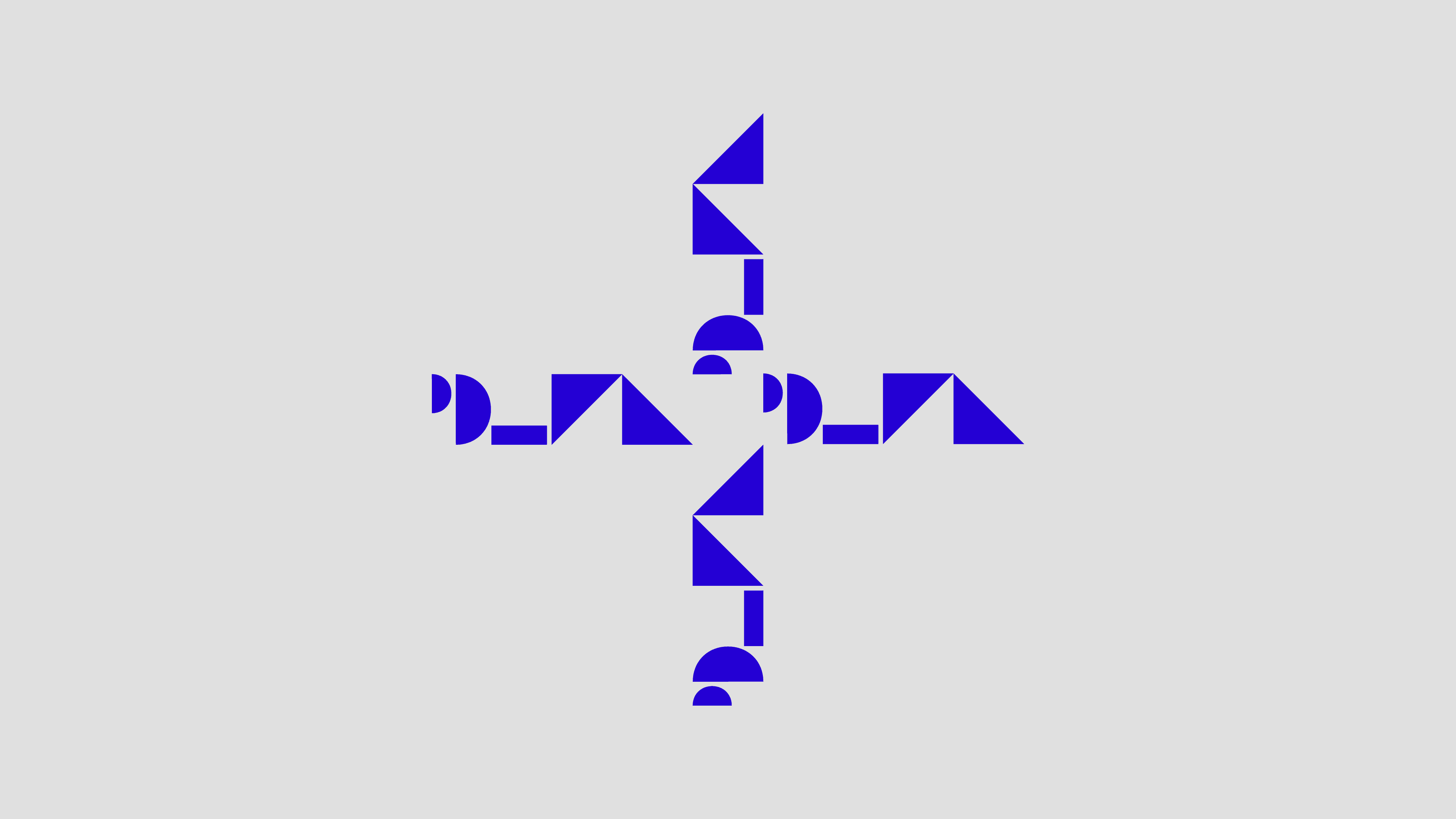
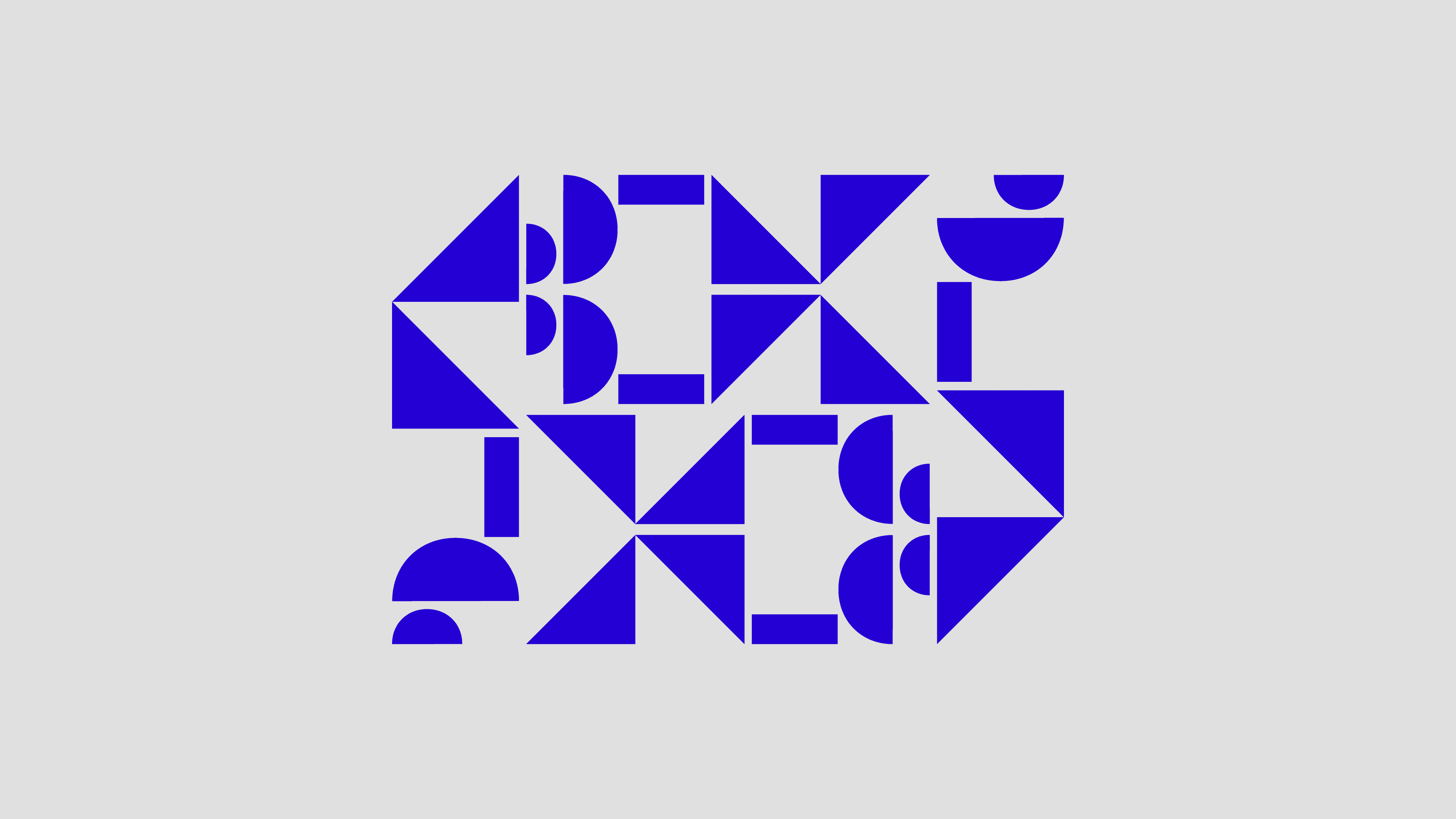
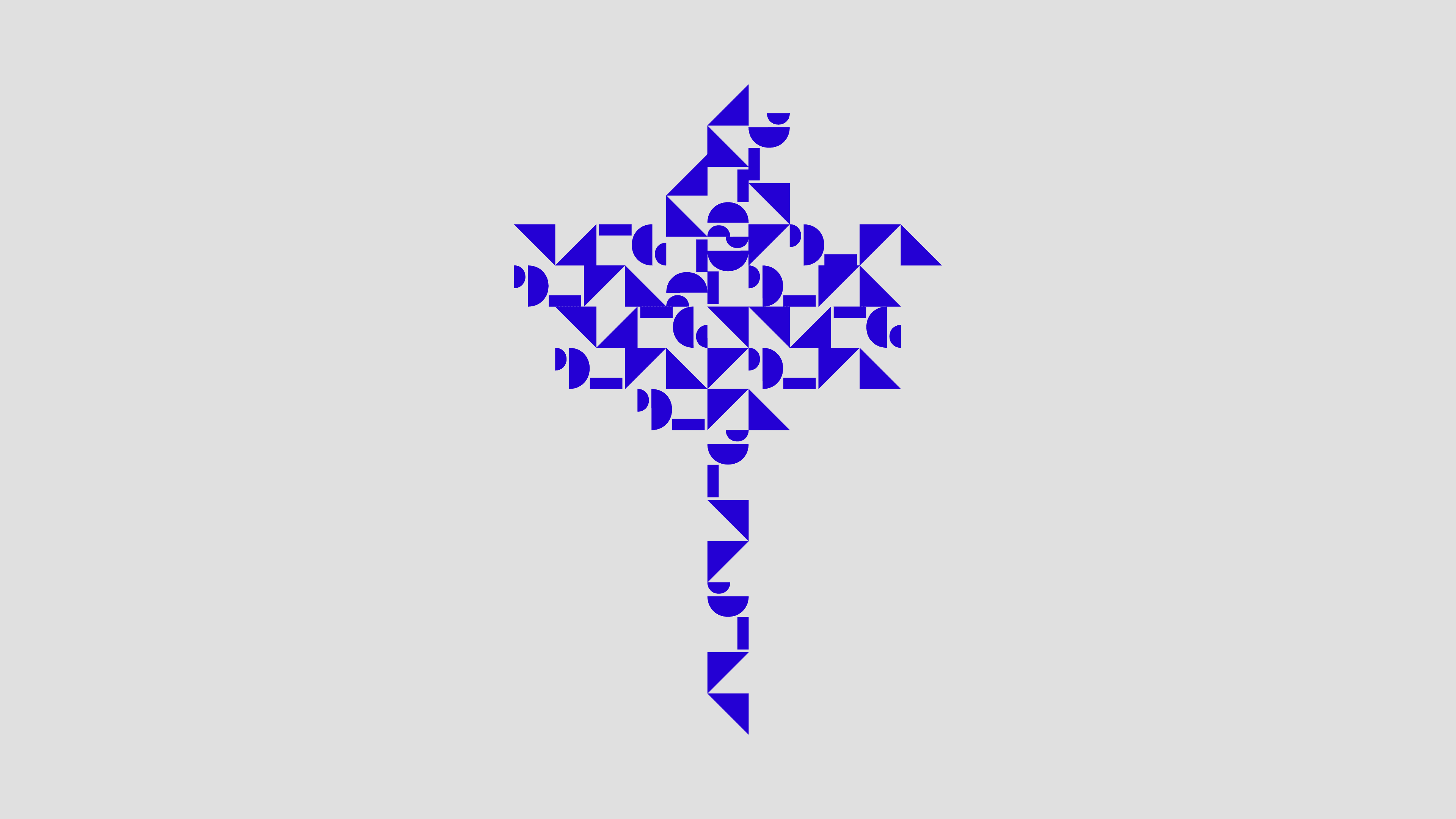
Derived from a shared geometric framework, the logo system balances consistency with flexibility across static and motion applications.
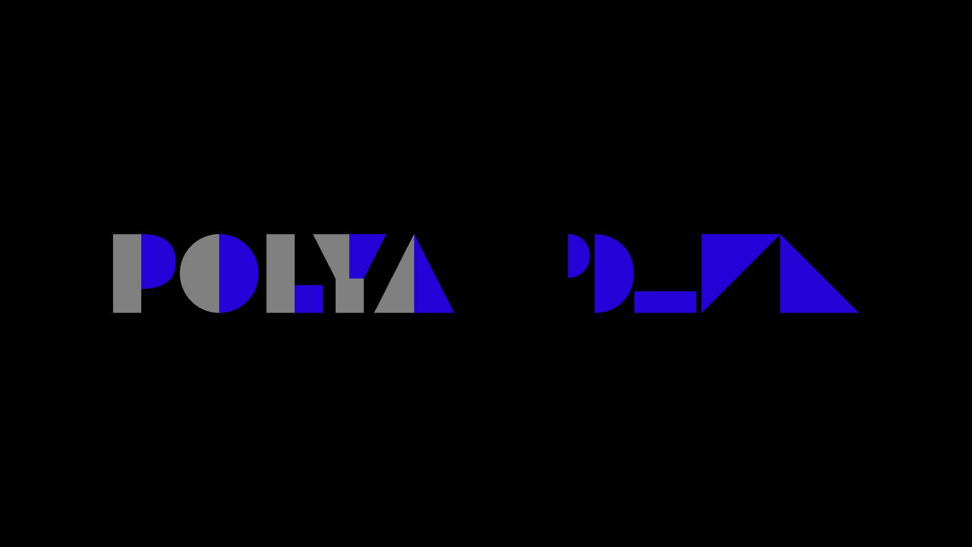

( Logo Motion Exploration )
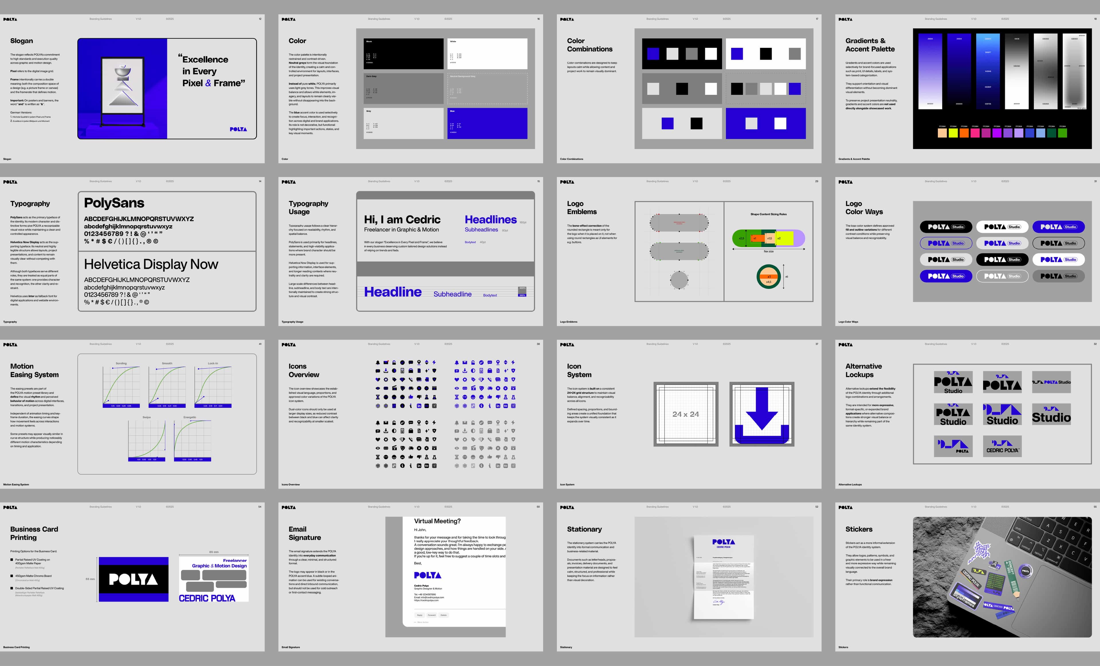
Typography & Color
Designed to Step Back
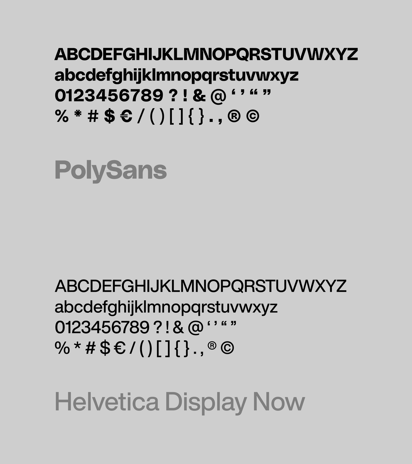
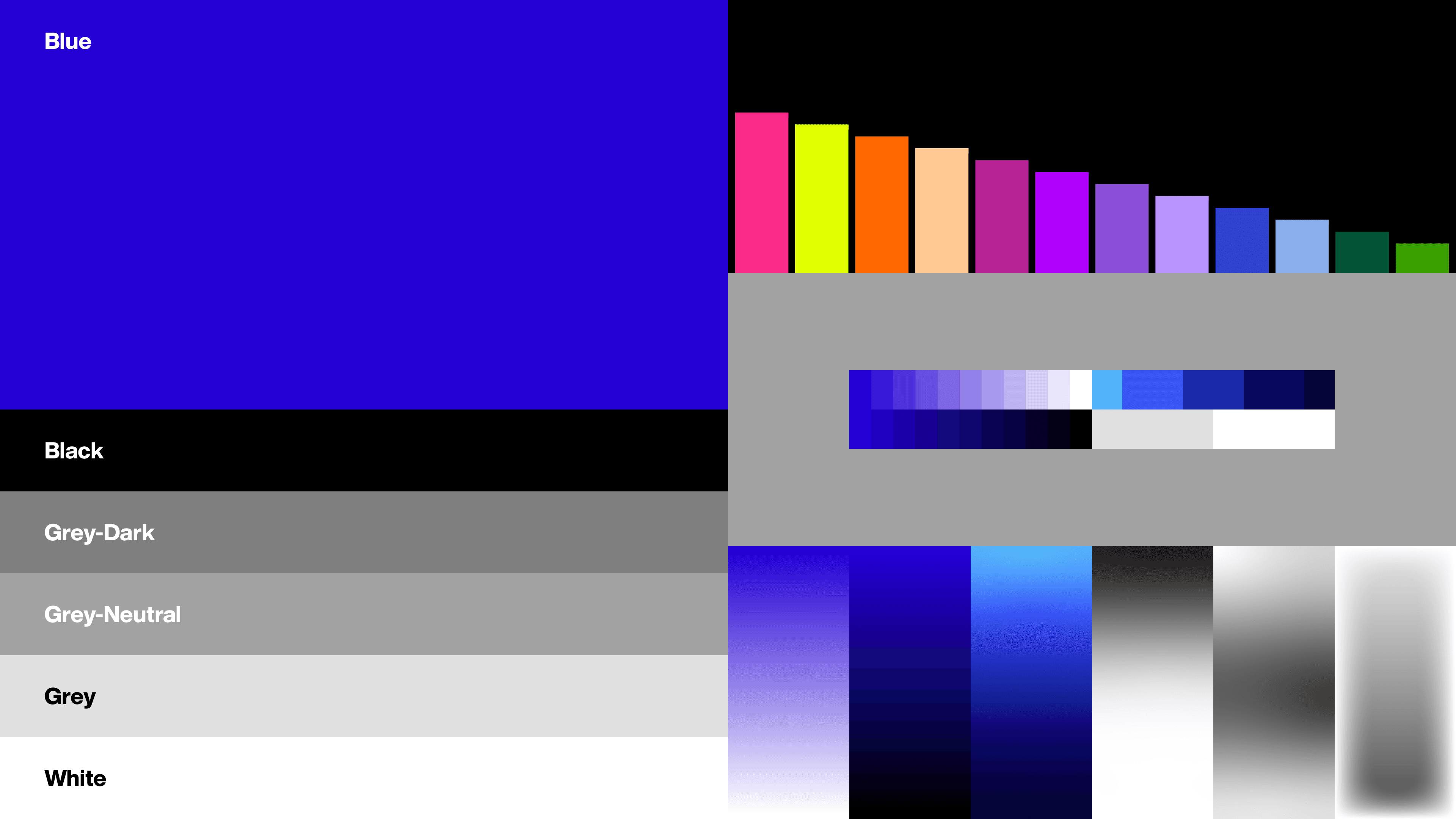
Rather than defining every interaction, typography and color provide a quiet framework that allows different project worlds to coexist within a consistent visual environment.
Iconography, Shapes & Patterns
Extending the Language
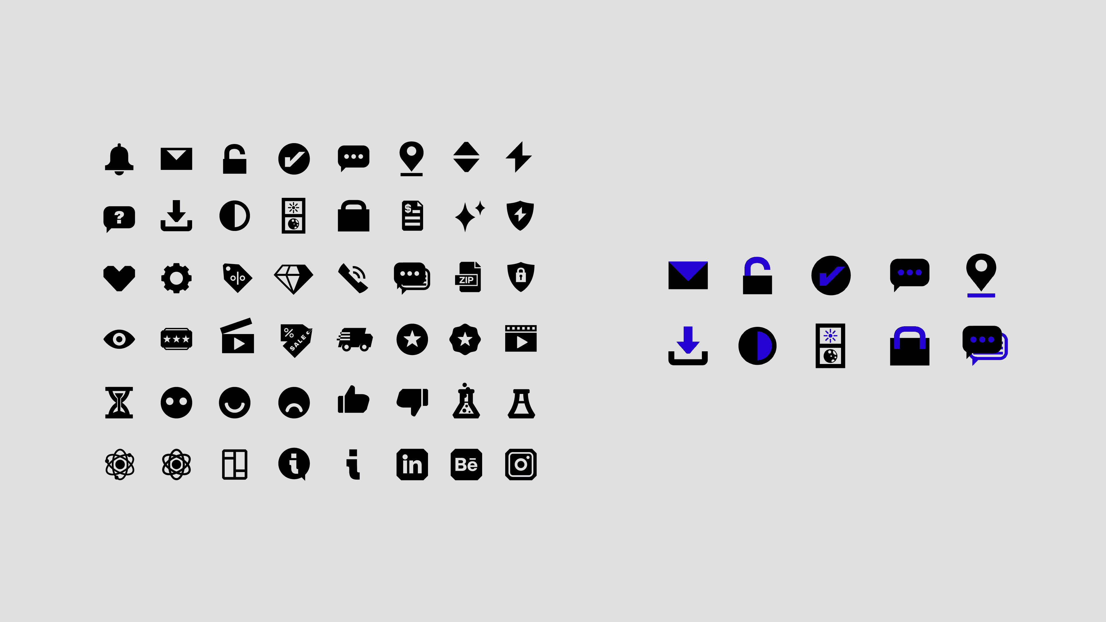
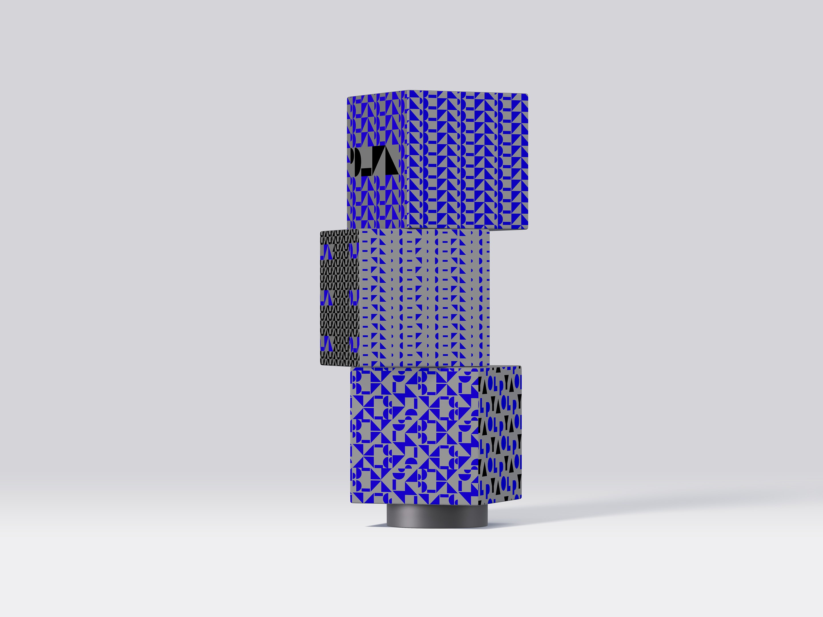
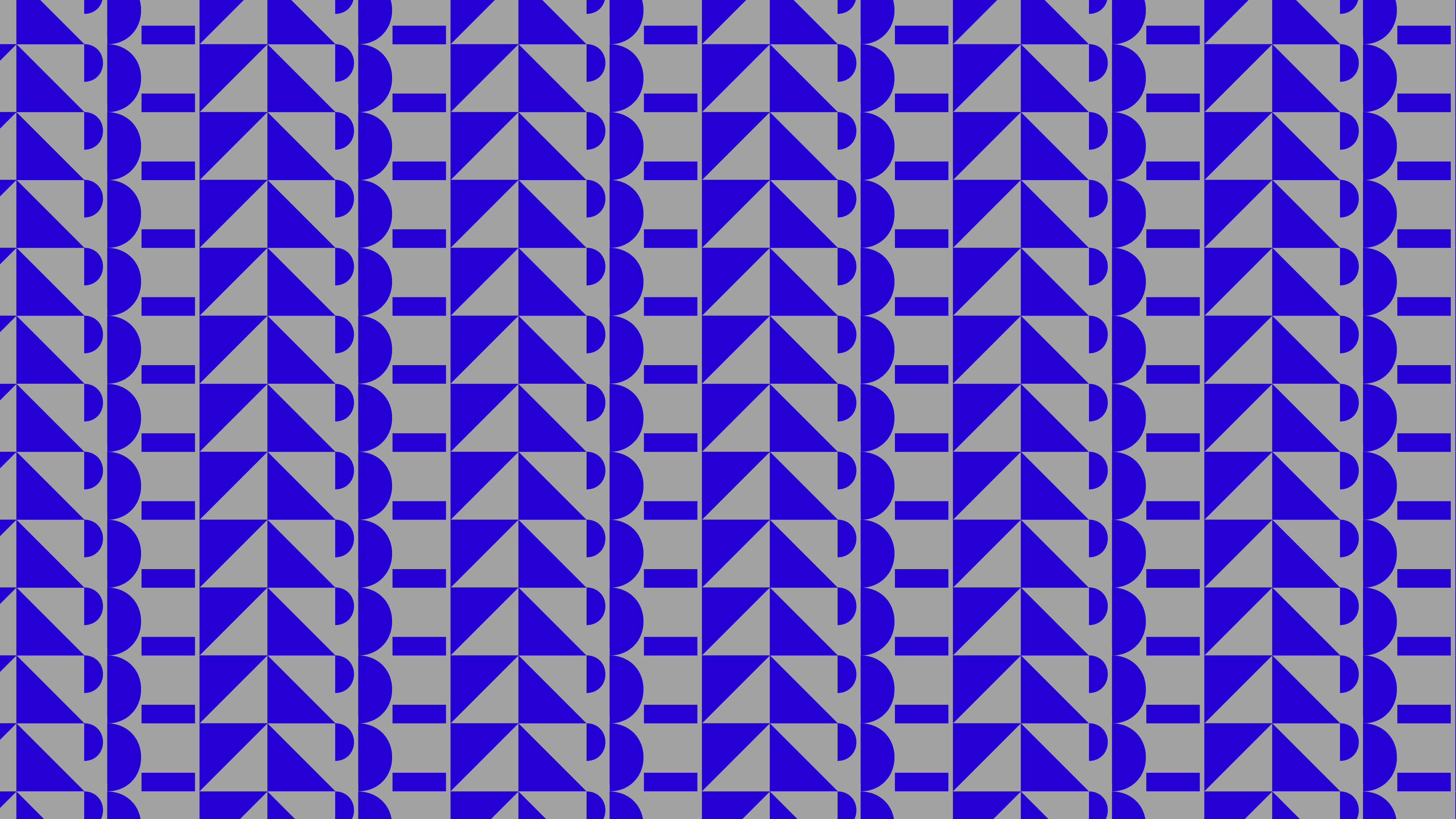
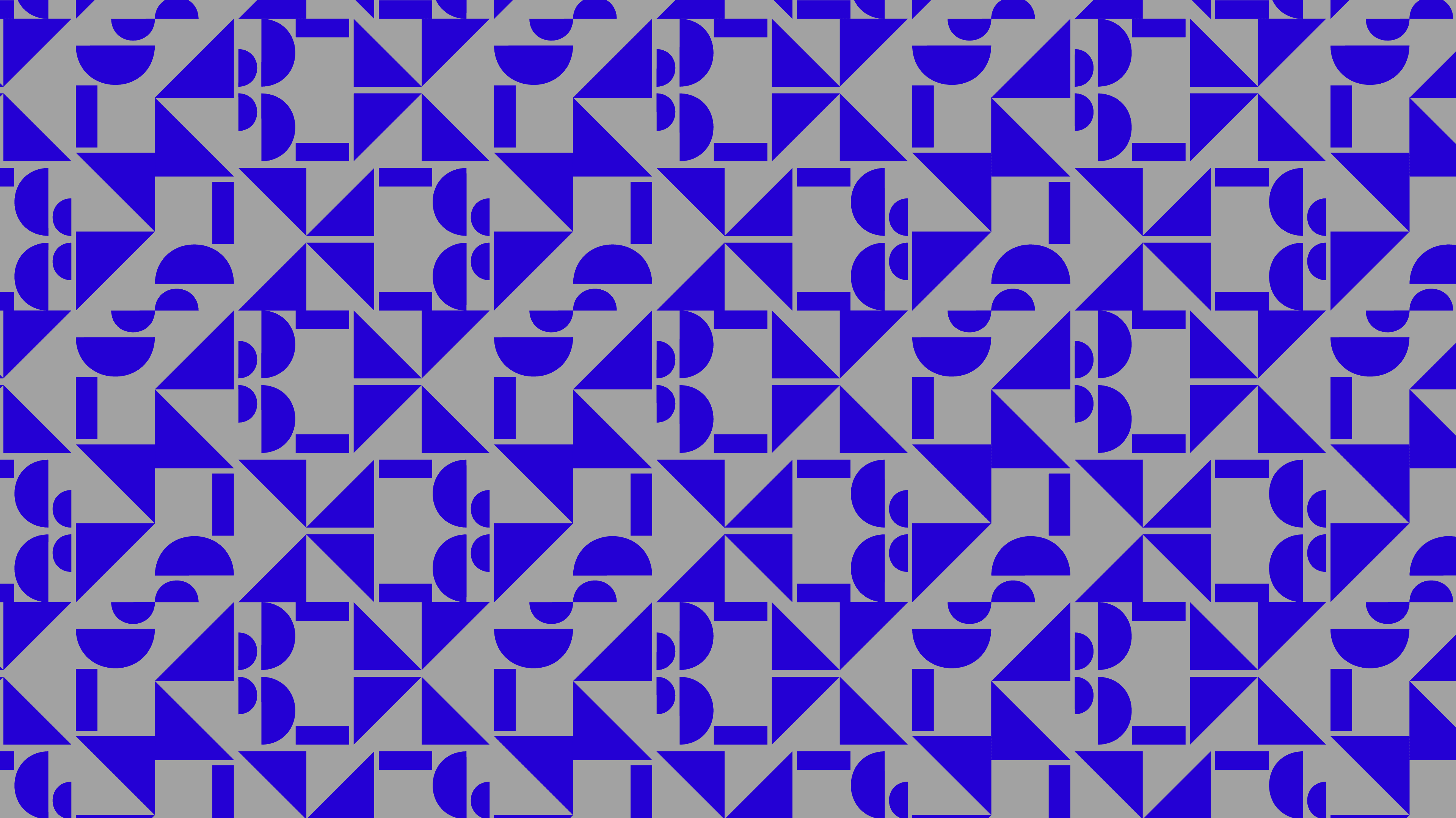
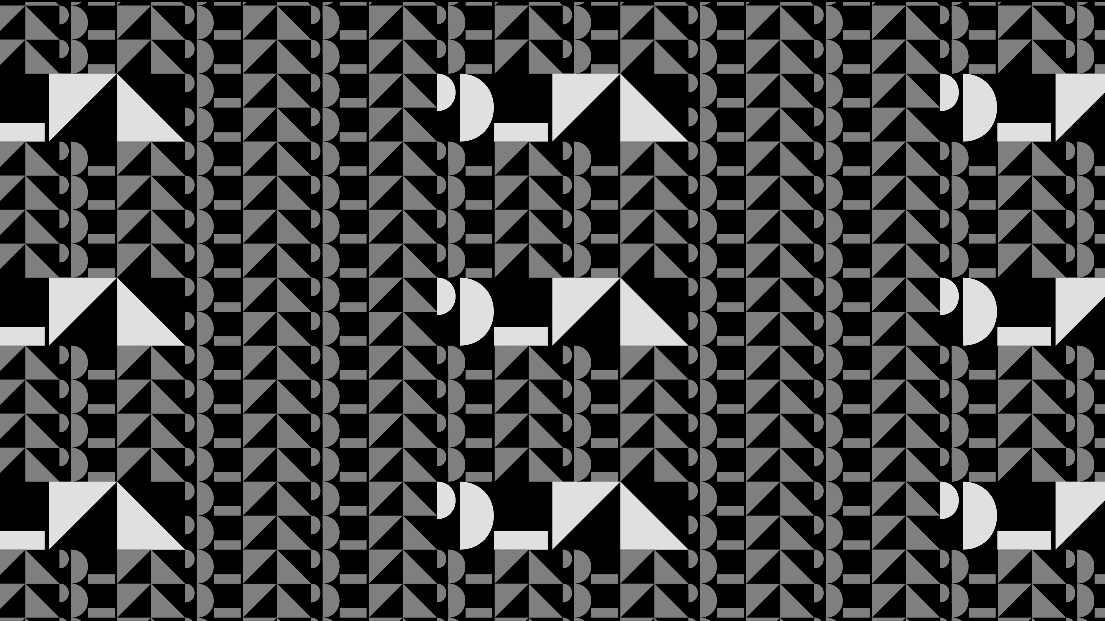
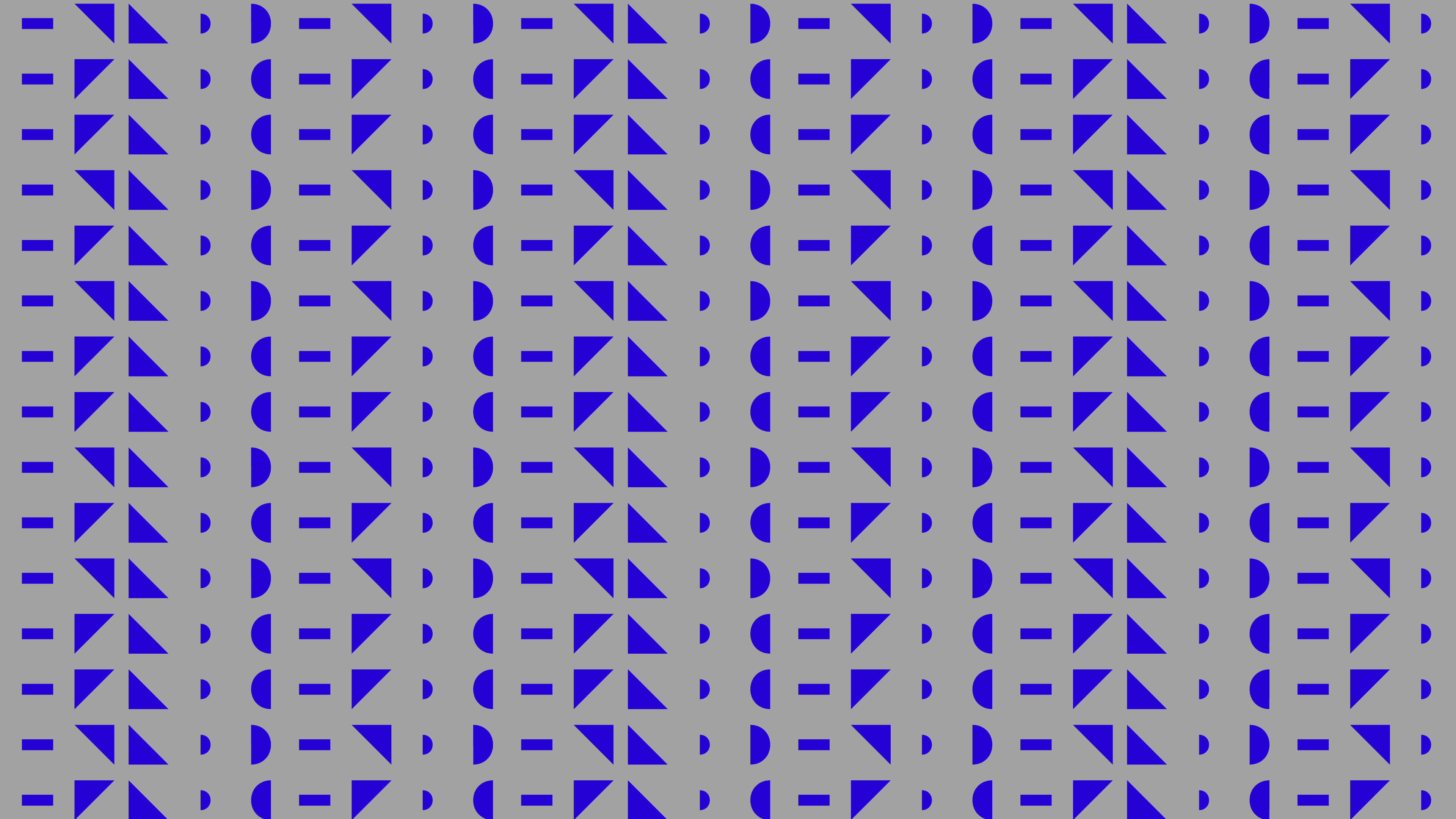
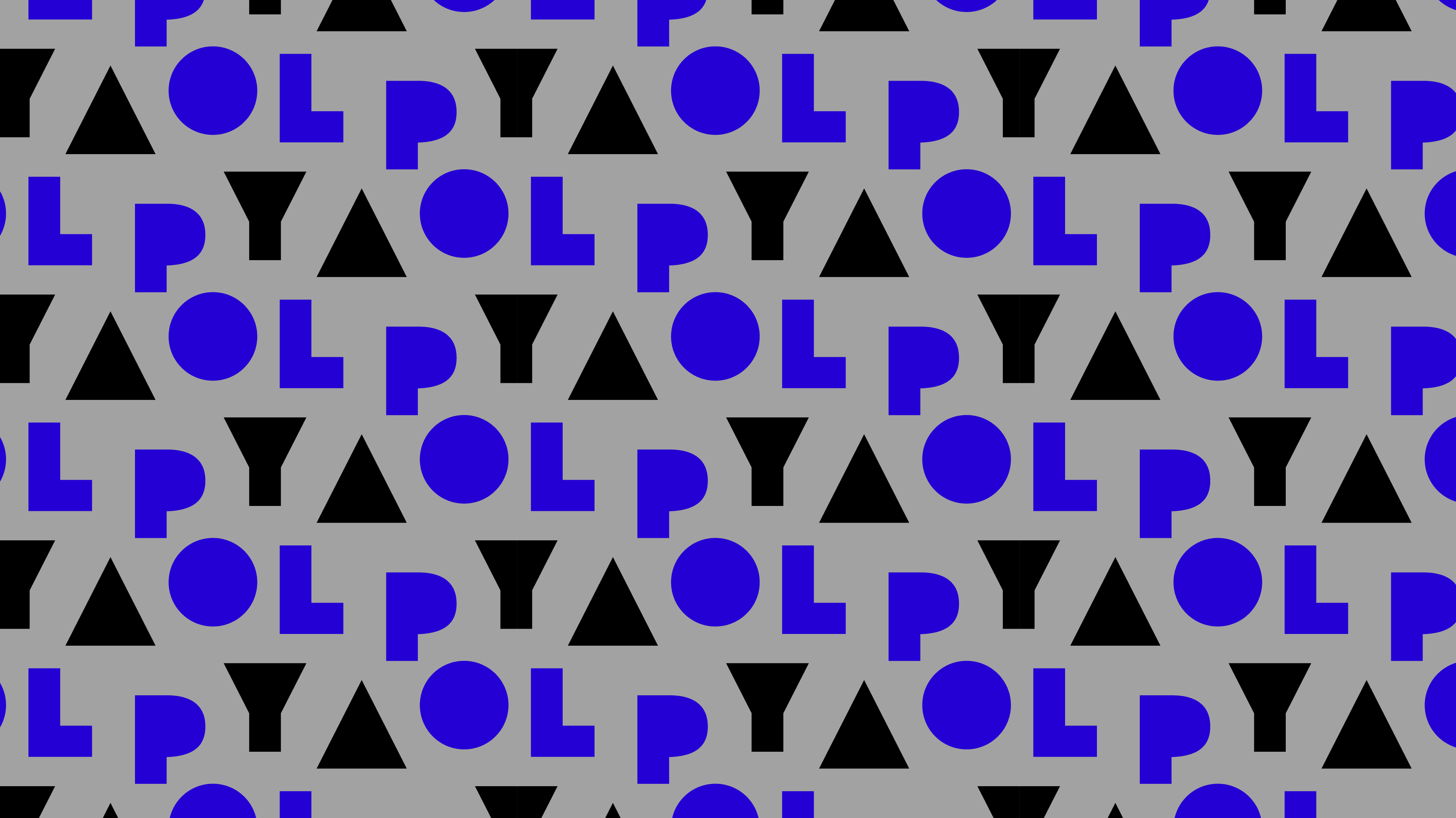
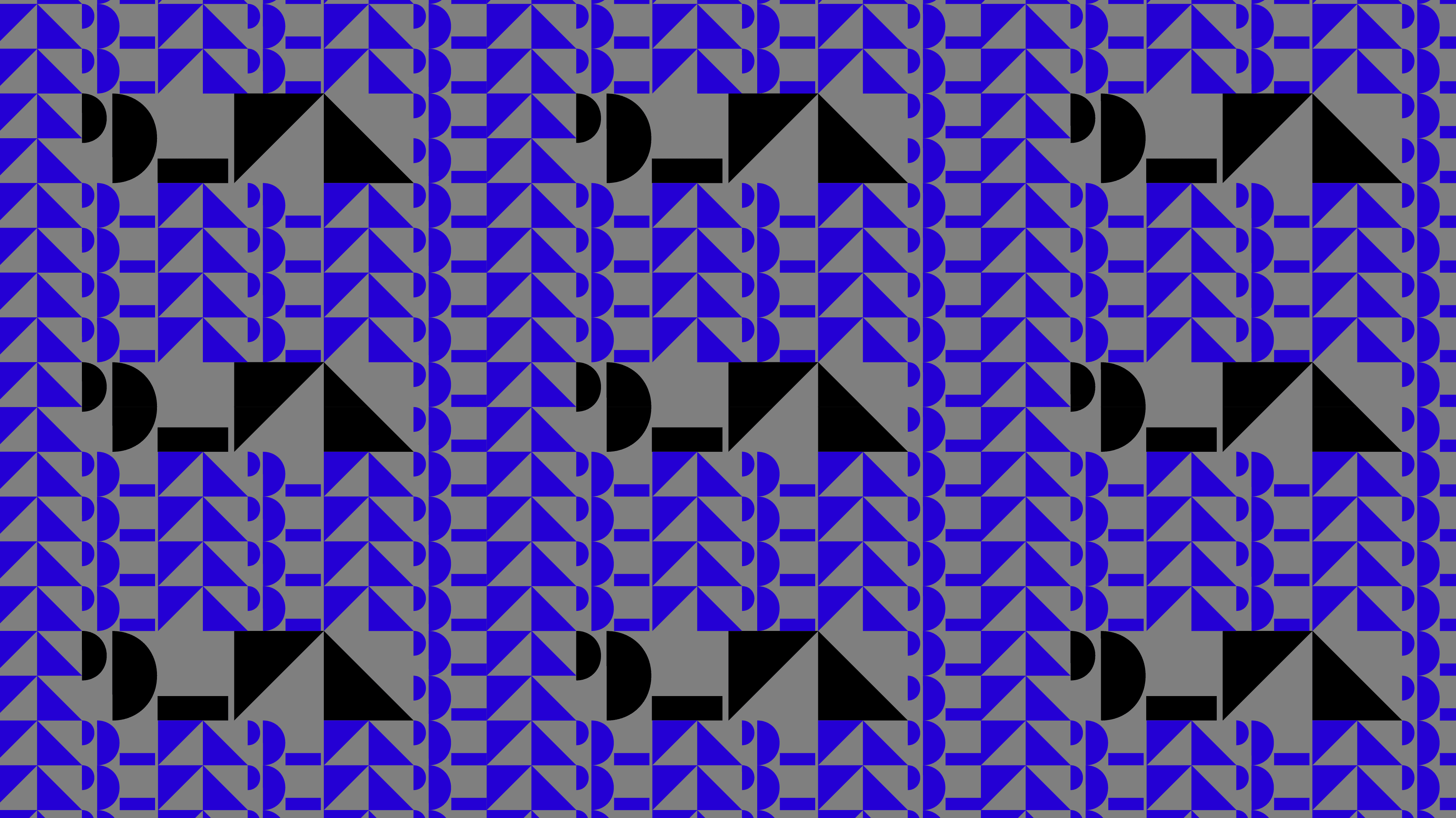
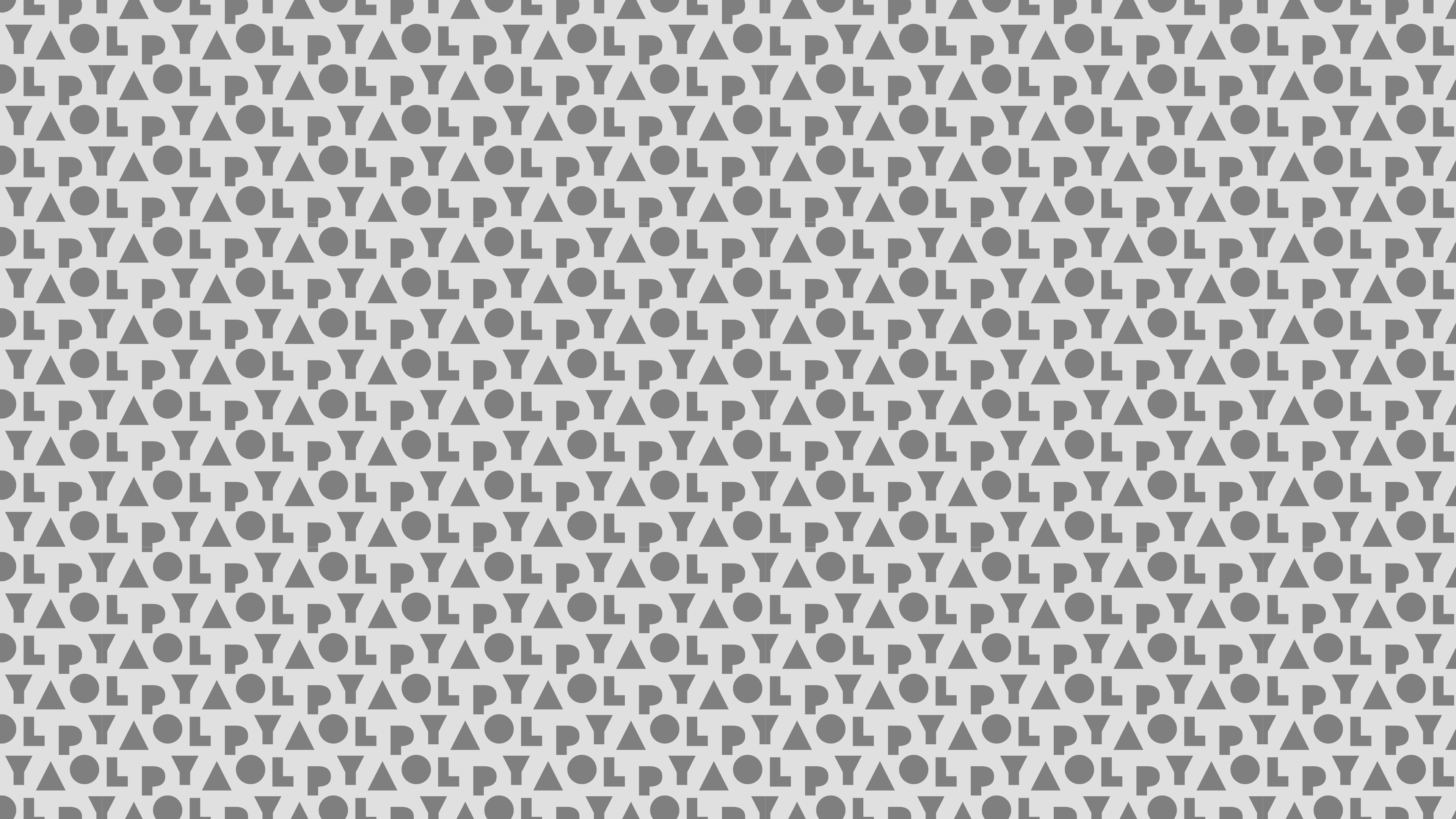
Designed primarily for digital applications, the icon system brings clarity and consistency to interface elements and supporting content. Complementary shapes and patterns extend the same visual language into broader brand applications.
Communication
Designed for Application
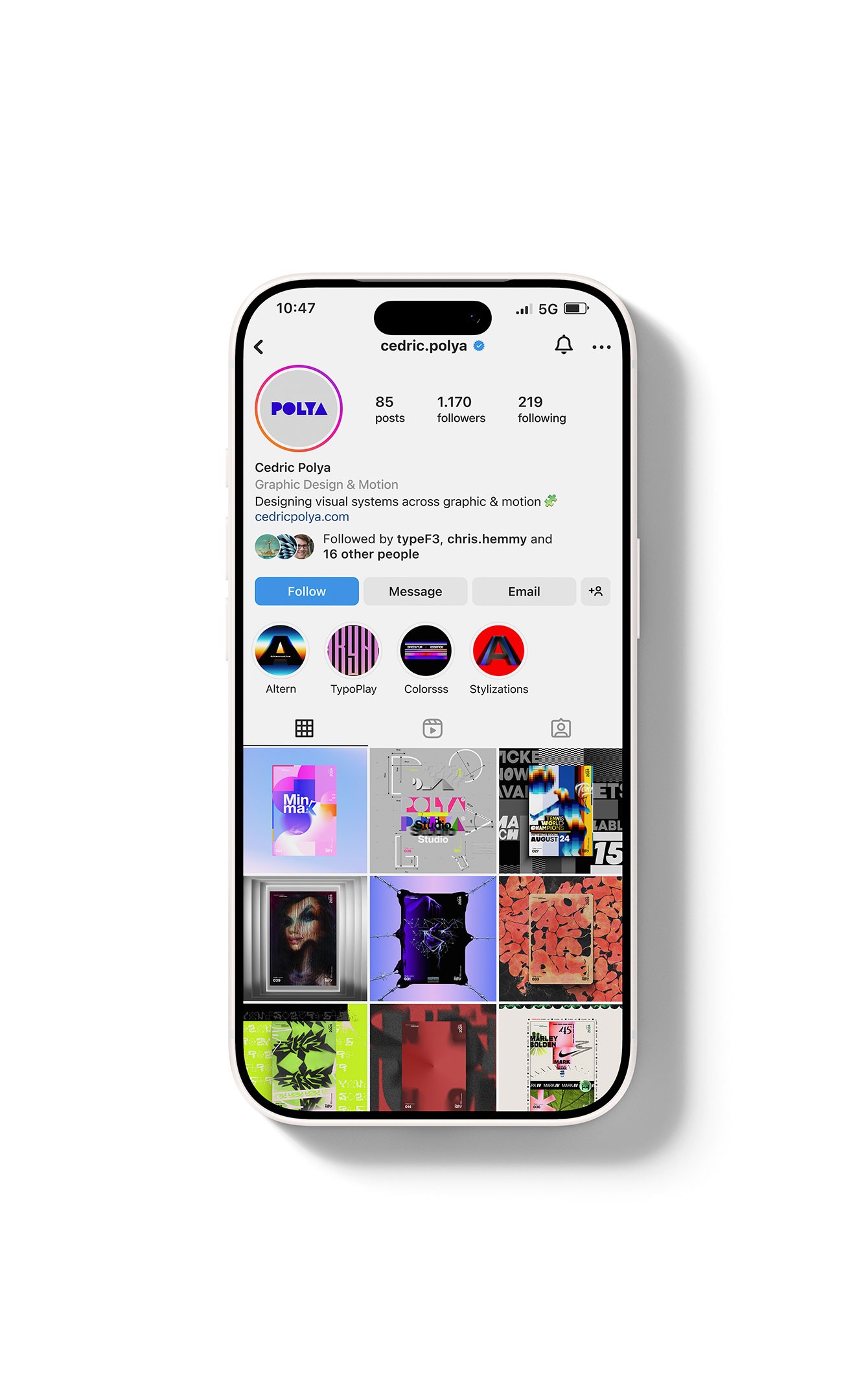
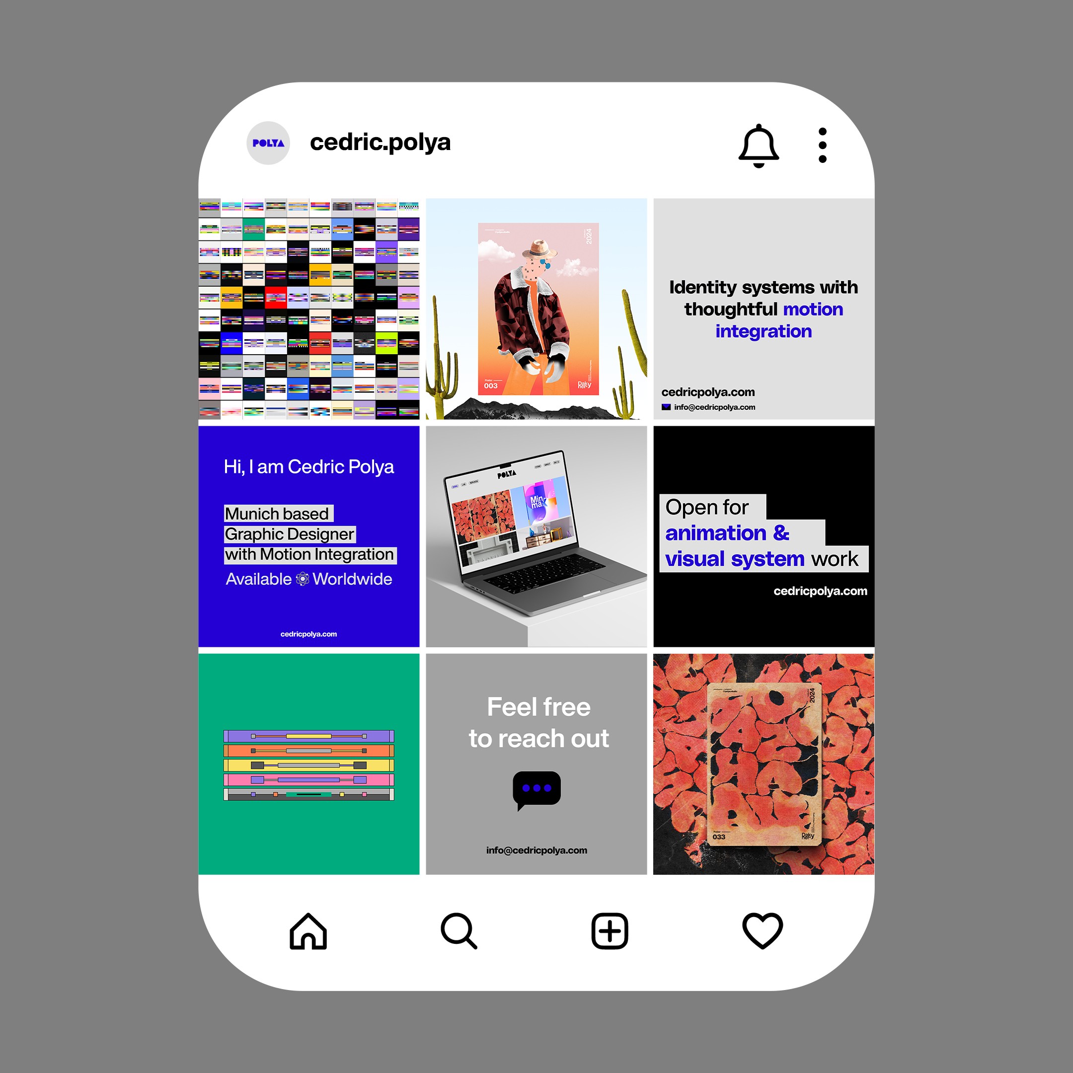
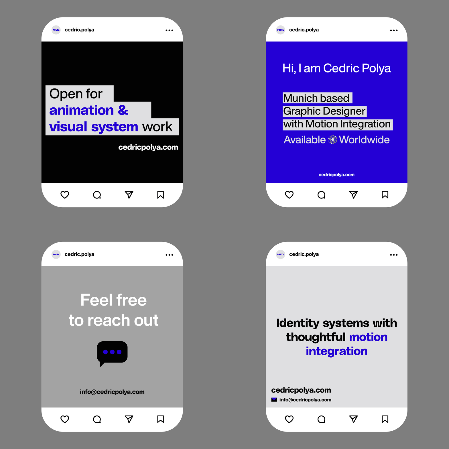
Built as a practical extension of the identity, the application system balances consistency with flexibility across both digital and physical environments.
Website
A System Beyond the Portfolio
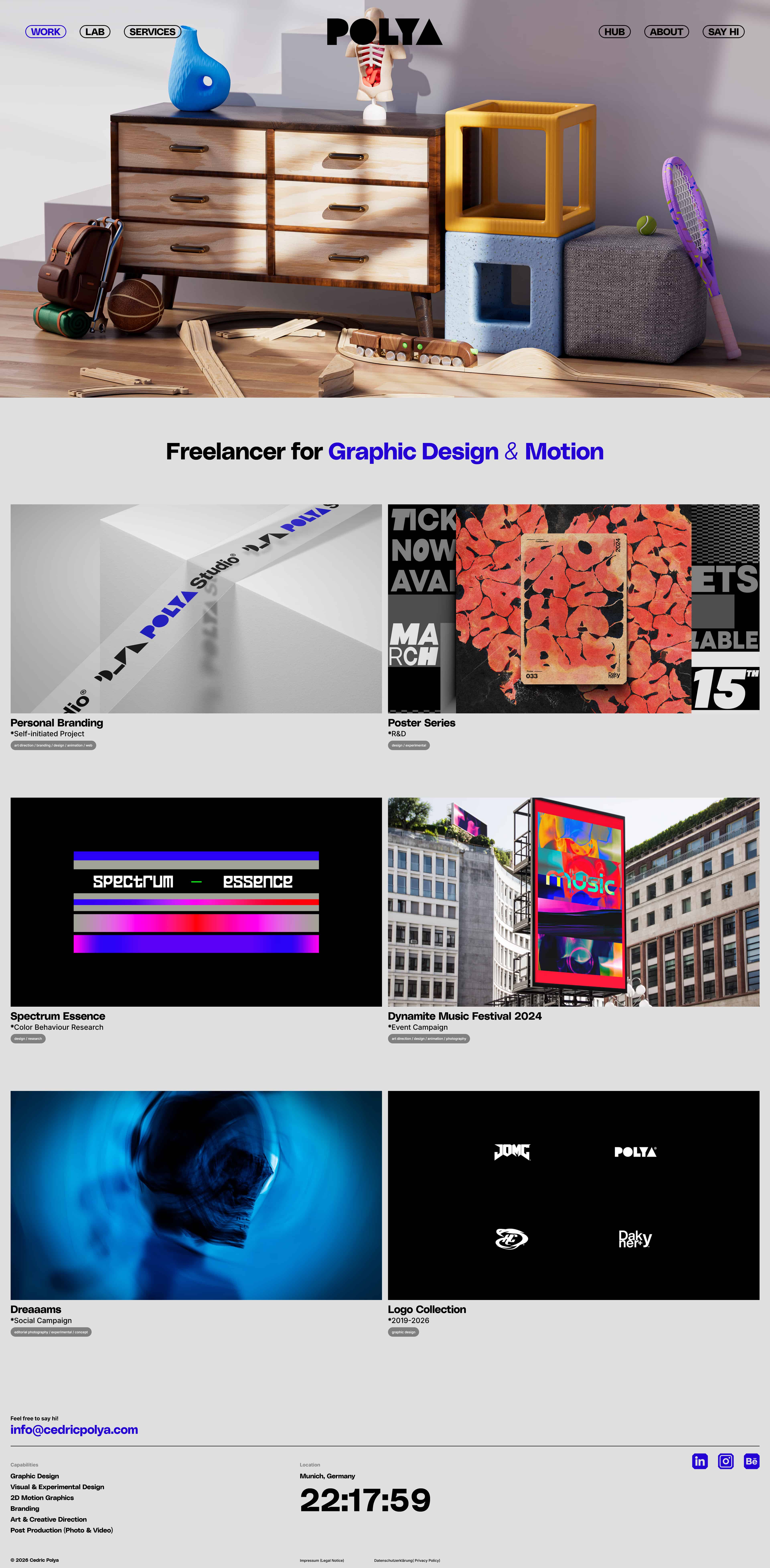
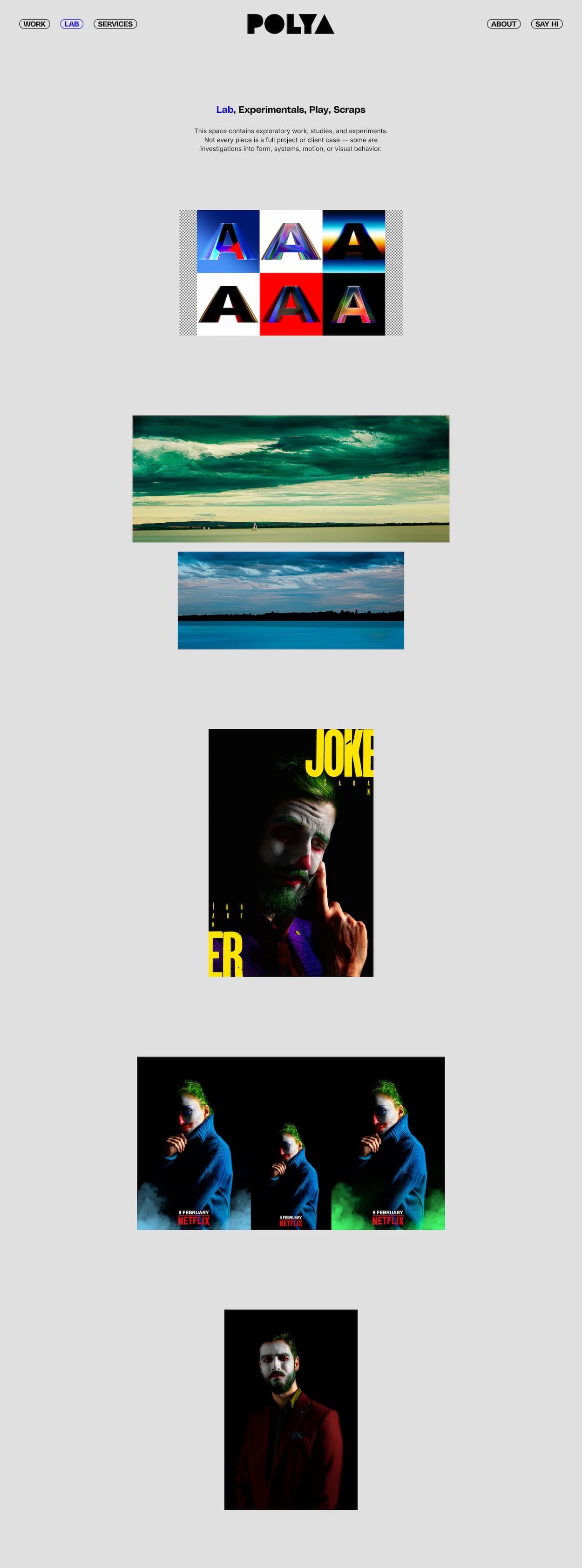
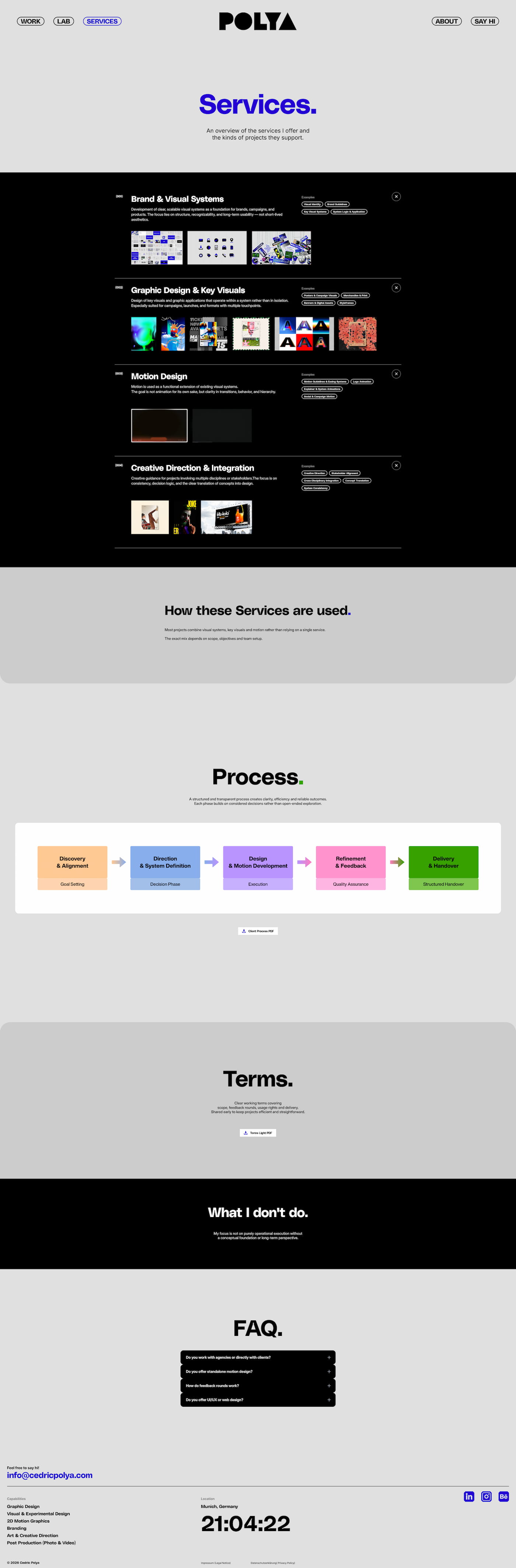
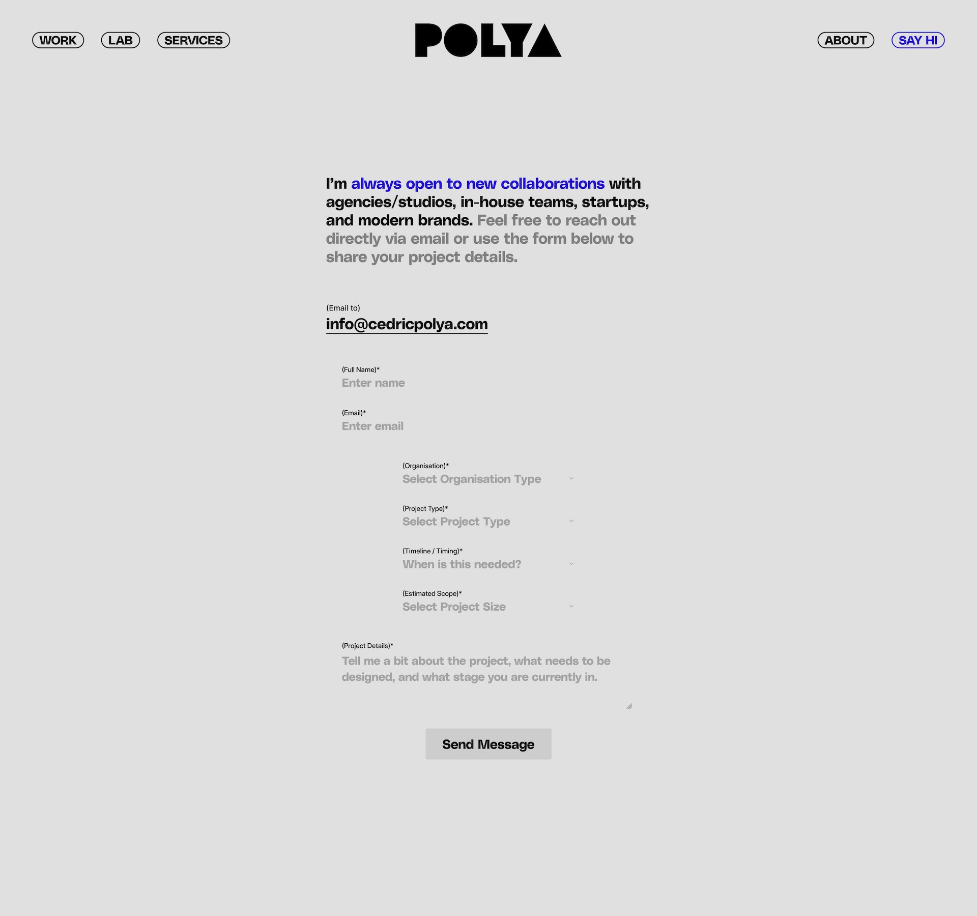
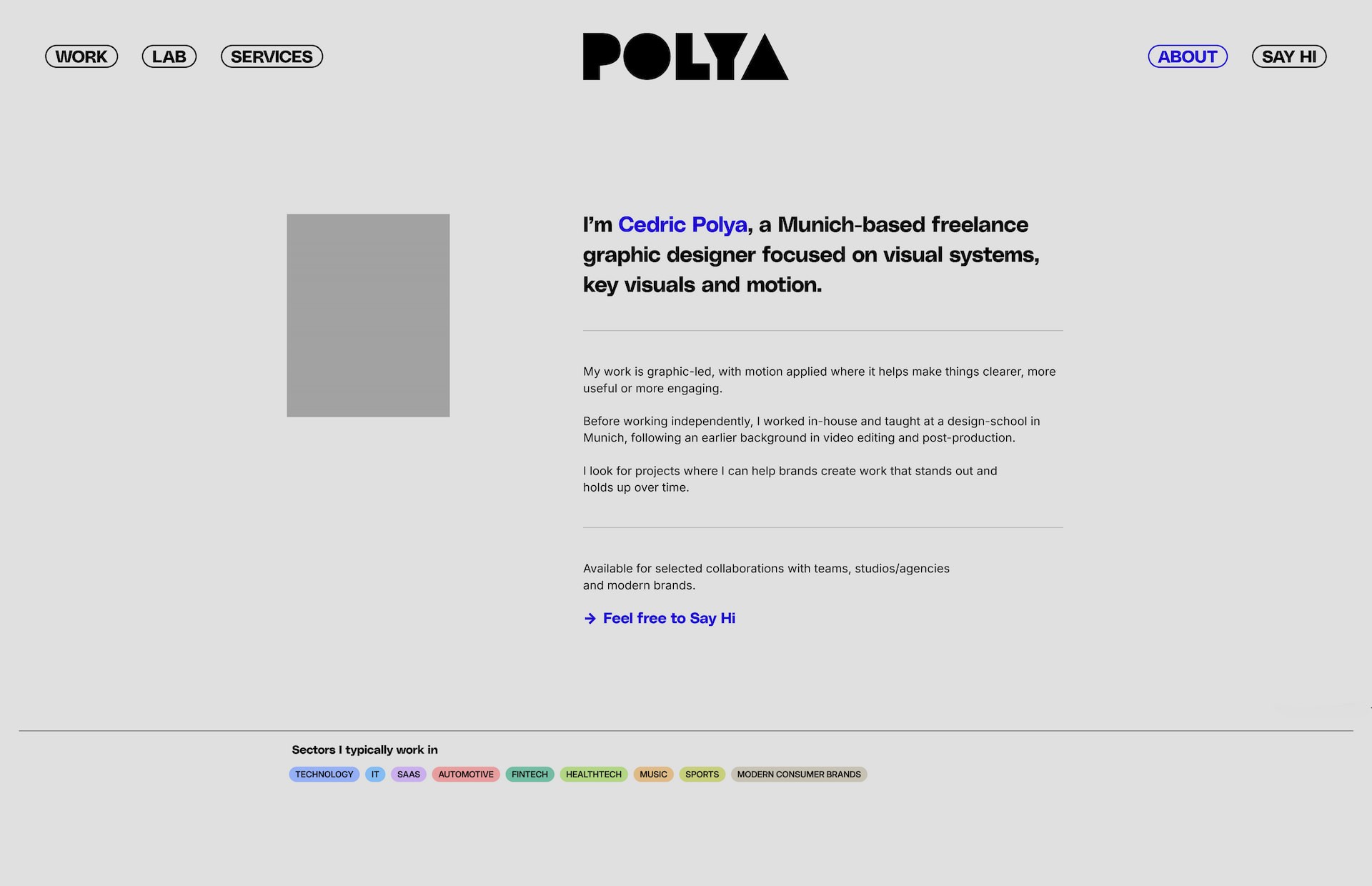
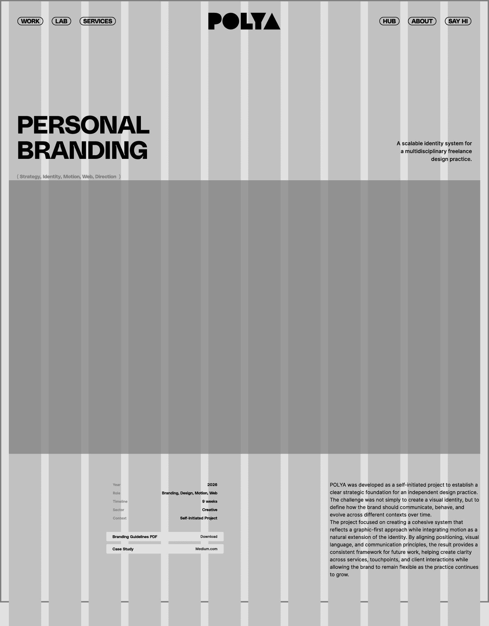
Built around a shared set of layout, hierarchy, and interaction principles, the website maintains consistency across project pages, core content, and future additions.
( Work in Progress )
Looking Ahead
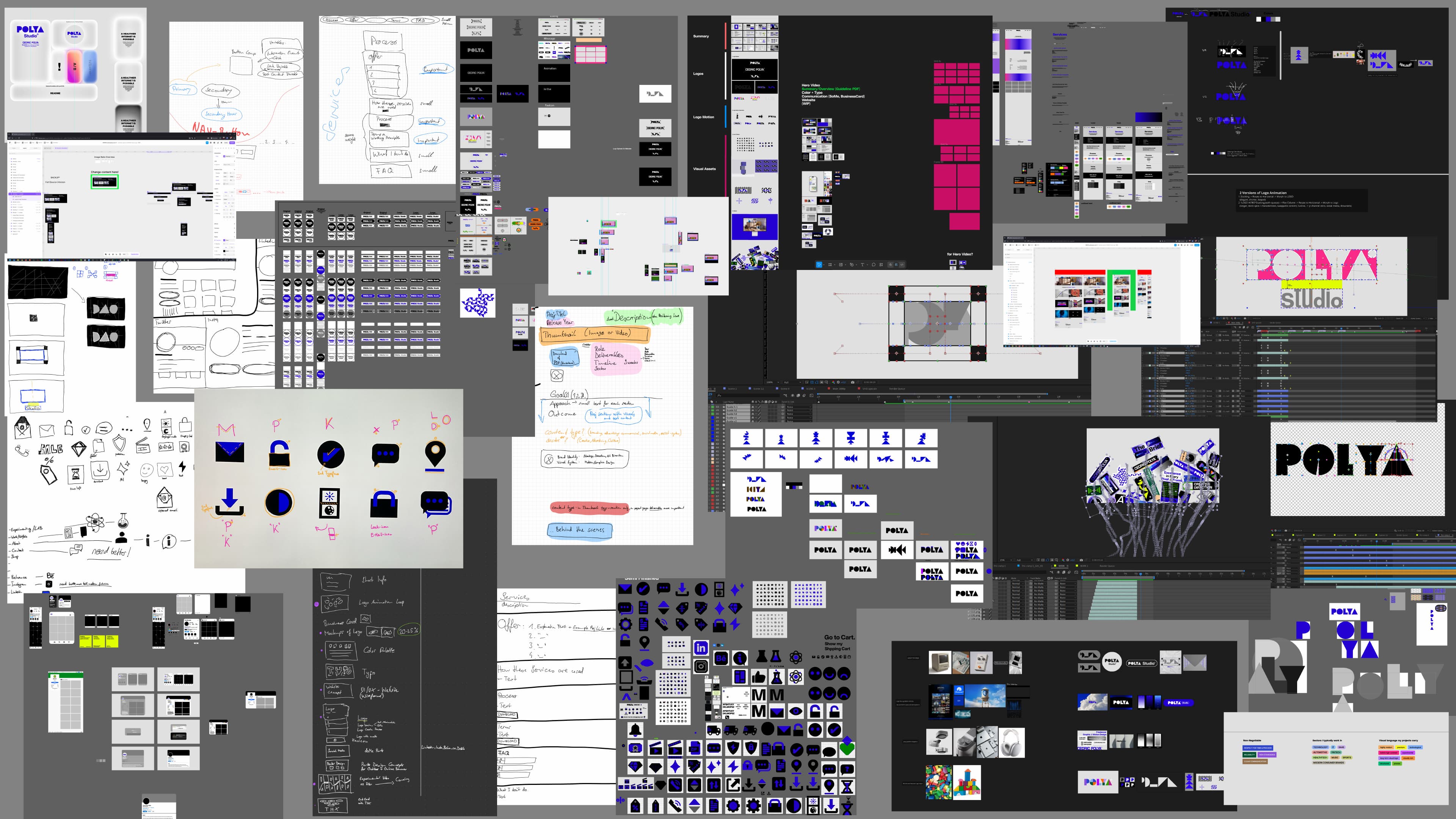
The project established the foundations of the POLYA brand. As the practice evolves, the system is designed to grow through new projects, applications, and real-world use cases while maintaining a consistent core.